Nabokov's Alphabet
Nabokov's Alphabet
Introduction
In Speak, Memory,1 Vladimir Nabokov describes his experience of synaesthesia — a perceptual phenomenon where stimulation of one sensory pathway leads to involuntary experiences in another. For Nabokov, this manifested most pronouncedly in the grapheme-colour (the association of letters with specific, immutable colours) variant.
In the author's own inimitable words:
Perhaps 'hearing' is not quite accurate, since the color sensation seems to be produced by the very act of my orally forming a given letter while I imagine its outline. The long a of the English alphabet (and it is this alphabet I have in mind farther on unless otherwise stated) has for me the tint of weathered wood, but a French a evokes polished ebony. This black group also includes hard g (vulcanized rubber) and r (a sooty rag being ripped). Oatmeal n, noodle-limp l, and the ivory-backed hand mirror of o take care of the whites. I am puzzled by my French on which I see as the brimming tension-surface of alcohol in a small glass. Passing on to the blue group, there is steely x, thundercloud z, and huckleberry k. Since a subtle interaction exists between sound and shape, I see q as browner than k, while s is not the light blue of c, but a curious mixture of azure and mother-of-pearl. Adjacent tints do not merge, and diphthongs do not have special colors of their own, unless represented by a single character in some other language (thus the fluffy-grey, three-stemmed Russian letter that stands for sh, a letter as old as the rushes of the Nile, influences its English representation). In the green group, there are alder-leaf f, the unripe apple of p, and pistachio t. Dull green, combined somehow with violet, is the best I can do for w. The yellows comprise various e's and i's, creamy d, bright-golden y, and u, whose alphabetical value I can express only by 'brassy with an olive sheen'. In the brown group, there are the rich rubbery tone of soft g, paler j, and the drab shoelace of h. Finally, among the reds, b has the tone called burnt sienna by painters, m is a fold of pink flannel, and today I have at last perfectly matched v with 'Rose Quartz' in Maerz and Paul's Dictionary of Color.1 Vladimir Nabokov, Speak, Memory

Nabokov concludes his catalogue with a specific impossibility: "The word for rainbow, a primary, but decidedly muddy, rainbow, is in my private language the hardly pronounceable: kzspygv."
Chromatic Abecedarium
My first encounter with the paragraph quoted above was on page 17 of a Penguin Modern Classics edition of the autobiography I found while browsing the bookshelf of my parents' apartment in Dubai. The white shelves in the hallway consist of an eclectic assortment of titles left behind by the interleaved visits my elder sister and I have made at our parental port on brief vacations from our educational voyages around the world.
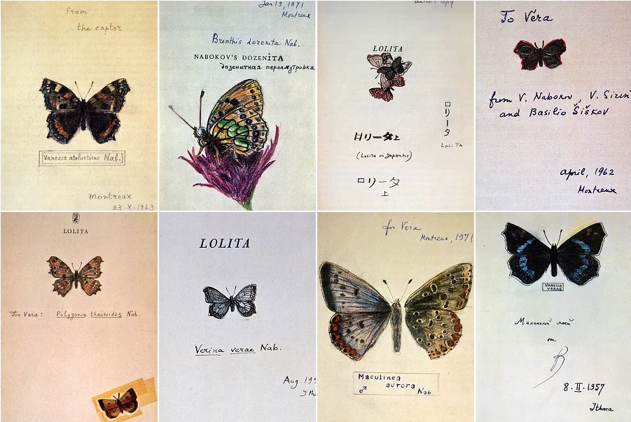
Struggling to imagine how the author must have perceived the words he wrote that appeared before me now in a very prosaic black, 10.5pt Dante MT on cream paper, browning towards the margins with the patina that familiar books adopt, I noted down a desire to render a visual instantiation of Nabokov's alphabet in some dusty corner of my mind. Prior versions (sketches, paintings) by artists exist,3 but I found none that truly [subjectively] captured the essence of his descriptions. Most crucially, none were computational, and hence none permitted me to see the muddy kzspygv rainbow for myself.
A navigable gallery displaying each letter in Nabokov's chromatic alphabet follows. Swipe or use keyboard arrows to explore the abecedarium. Click the dots below to jump to a specific letter, or click any card for an enlarged view. Below the gallery, an interactive name visualizer generates a shareable identity card based on your input.4
On Synaesthesia
Synaesthesia holds a particular fascination for neuroscientists, especially those who investigate perception.5 Nabokov was rather apologetic about his description of the phenomenon: "The confessions of a synaesthete must sound tedious and pretentious to those who are protected from such leakings and drafts by more solid walls than mine are." Reportage of interior experience from residents of minds with permeable walls allows those of us with more standard divisions of sensation to reflect fully on the existence and architecture of the walls themselves. Perception, say of the visual kind, involves integrating diverse features detected independently by specialised subsystems, which must then merge into a coherent whole: a gestalt.
We already bind features from within a 'room' despite the diverging branches of signal processing that result in their detection, such as colour, shape, and motion; synaesthetes go one step further, binding aspects that usually sleep apart. Psychedelic experiences can temporarily induce similar cross-modal bindings in non-synaesthetes, providing a first-person simulation of the world as seen by Nabokov or Kandinsky.
Recent research suggests this binding occurs at high cognitive levels rather than in early visual processing. When a synaesthete perceives a letter's colour, that experience primes subsequent colour perception regardless of spatial location — a pattern inconsistent with the retinotopic organisation of primary visual cortex.6
The specific associations are idiosyncratic: Vera (Nabokov's wife, muse, typist, editor, chauffeur, etc.) also experienced grapheme-colour synaesthesia, but her palette differed entirely from his. Their son Dmitri inherited the condition, and his colours formed a distinct third set where at least one letter's hue was a combination of the parents'. "As if the genes were painting in aquarelle."7
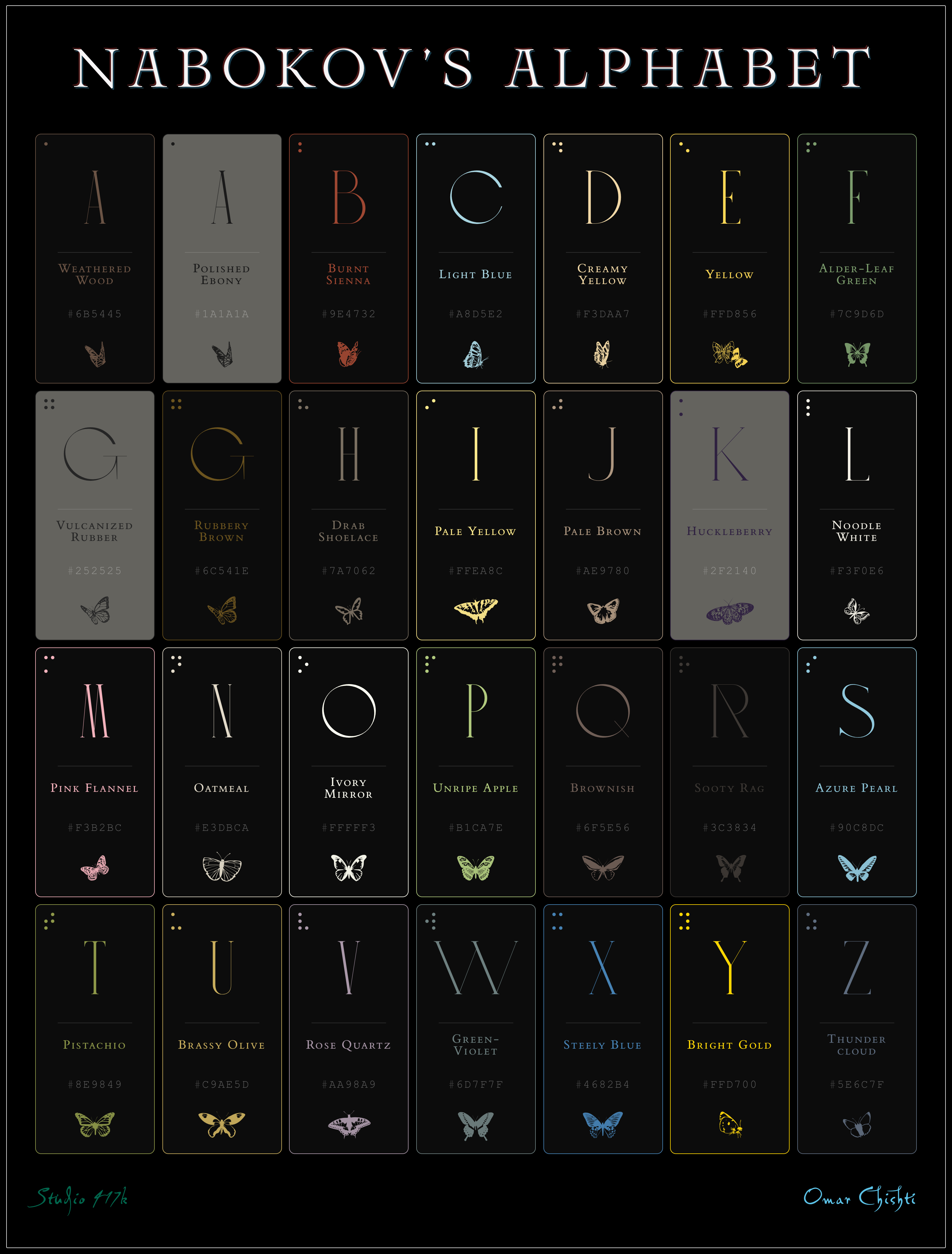
Palette Poster
The following poster presents Nabokov's complete chromatic alphabet in a typographic specimen format. Each letter is accompanied by the precise colour swatch derived from the descriptions in Speak, Memory. Colours with luminance below a set threshold are set in lighter backgrounds for legibility.
Your Name in Colour
This tool allows one to see how Nabokov may have perceived one's name, filtered through his synaesthesia. A few additional [optional] fields can be filled out to generate a design-forward identity card. I focused on a handful of high information-density facets of life perceived from a literary lens. I do not collect any data, but would be happy to receive the resulting cards from readers who would like to share.
Conclusion
Crystallising one's own qualia with a satisfactory degree of fidelity via permutations of letters and combinations of pixels is a challenging undertaking. To attempt the same for another person (no matter how remarkable their felicity with language or devotion to the gradations of experience) is an exercise in futility. I attempted to map Nabokov's descriptions to RGB colour space by sampling images of the materials described, or by consulting the Color Dictionary he was known to employ9 (thankfully digitised and translated to hexcodes by a lab at MIT). Several letters employ direct matches: burnt sienna, pistachio, huckleberry, and rose quartz appear verbatim in Maerz & Paul, while brass matches Werner's Nomenclature.10 I cannot claim any degree of scientific exactitude was accomplished by this method, merely a representation I (and consequently, I hope, my readers) find useful.
"Weathered wood", to take the first example, can span a range of browns depending on the origin of the wood, the degree of its weathering, and the illumination levels of Nabokov's imagination. The exact hues remain, ultimately, inaccessible — locked within the private theatre of one of the 20th century's most extraordinary perceptual apparatuses.